The Corporate Sphere
For the past few years, the shift to brand minimalism has been noticeable, especially in the corporate world. Several factors have been pushing this movement. Companies want to present themselves as modern and cutting-edge, with a reimagined logo to carry that message clearly. Minimal designs that include considerable amounts of blank space evoke an idea of “cleanliness,” and often focus the eye towards the central design rather than more distracting elements. With fewer details for the eye to process, the design comes across as less busy and quicker to identify, if only a split second sooner. When you only have a couple seconds to sway a potential buyer, every little bit helps!

Lifestyle Minimalism
Minimalism is present in other heightened aspects of current culture. The luxury look in fashion focuses on a few complimentary colors, if not total monochrome) with carefully chosen accent pieces. Expensive interior design photographed with bare, white walls and empty coffee tables to give the impression of spaciousness. Even in cosmetics, the natural look for complexion appears to be on the rise Despite the lavish lifestyles of the rich and famous, the current trend seems to be “appear as though you have little, even though you have lots.”

Consumer Minimalism
Even from your average consumer standpoint, minimalism makes sense. Now more than ever, people are aware of the quantities they buy, own, use and throw away. The conscious consumer is a reality, and buyers are searching for ways to purchase less and go longer between purchases. Where brands can capitalize on this interest is by offering recycling programs for product packaging and a subscription model so that customers can opt out of “shopping around” for a certain product (e.g. a sunscreen) in favor of “settling down” with a brand that provides them with exactly how much they need, as they need it.
Possible Setbacks
Minimalism does have its downsides though. In modernizing so extremely, a brand can lose sight of the details that made them so unique at their beginning. Take the Mozilla Firefox logo for example.
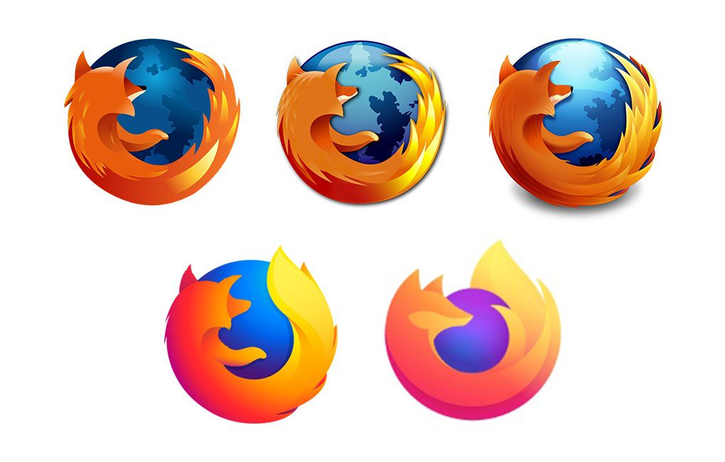
Take the Mozilla Firefox logo for example. The first couple changes to the logo are minor, and even bring more illumination to the design. There’s three clear elements: the world, the fox, and its fiery tail. But as the logo was redesigned with a more minimalist view, the sense of the globe vanishes completely, and the fiery tail loses more detail. While doubtful that consumers are put off by this one aspect of the Firefox brand, it does serve as a clear example of minimalism causing a loss in sense of identity.
Here’s where corporate culture and consumer culture fall out of alignment.
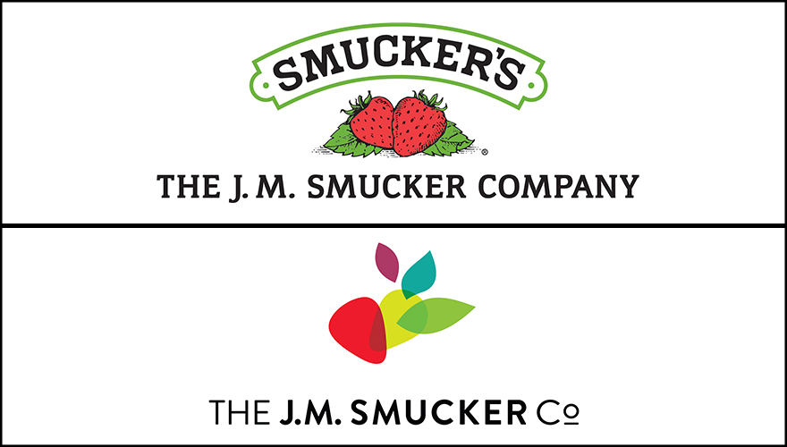
When the Smucker company released their new corporate logo, some consumers were worried that the old familiar logo would soon be gone from their jam jars. The corporate logo is bizarrely abstract with colored shapes that symbolize “creativity, growth, and heritage.” Barely a sense of the original “berry” remains. The older logo is artistically pleasing with details that appeal to the idea of farm-grown fruit, from the strawberries to the font of the brand and its border.
Don’t worry, the new Smucker’s logo is only for corporate use as they’ve expanded into other food markets; fruit jam jars will still retain the old, familiar design. But it’s a clear example of how even as a company uses minimalism to branch out, they still lose sight of their original brand charm.
Looking to You
So is minimalism the right step for you? Let’s consider a few things. Minimalism can be useful for honing your target audience, but in casting a net too narrow, you risk missing out on potential customers. It can provide a refreshing design, but perhaps lack a few personable details.
Are you more focused on:
- A “hip” appearance, or one that’s more homely?
- Reaching out to other businesses, or to consumers?
- Products and services catered to one particular audience, or several?
These questions only scratch the surface of the brand consulting that we can provide for you. If you’re interested in starting a conversation, head to the contact page on our website and shoot us an email. Looking forward to hearing from you!
